Project Details
- Company:
- CXone Expert (previously MindTouch)
- Feature:
- Content Framework
- Goals:
- Easier to use by content creators, improve content findability by end-users
- Audience:
- Knowledge Managers, Technical Writers, Content Creators
- Skills:
- Research, Plan, Design, Build, Test
- Tools:
- Basalmiq, Photoshop, CSS, HTML5, JavaScript, DekiScript
Feature Overview
MindTouch is a knowledge management platform used by companies to create Support, Success, and Product focused self-service documentation. This platform is used by businesses to proactively educate their customers when and where they need it most.
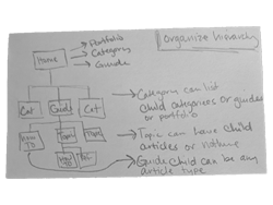
The content framework is how MindTouch organizes content in the platform. It provides multiple ways for users to navigate and find content throughout a company's site. Content is organized in a hierarchical structure.
While users loved being able to customize their hierarchies and content navigation pages, there were some experience issues with managing content and understanding how to create a good information architecture. As the Lead UX Designer on this project, I was able to create a new design that not only made it easier for Content Creators to organize their content hierarchies, but was responsive to any adaptations they had in their UI.
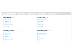
There have been two previous versions of the MindTouch content framework.
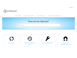
Old content framework hierarchy
- Portfolio: home page with simplfied navigation links to top level pages
- Product Guide: high-level organizational pages (e.g. Products, Personas, etc.)
- Guide: sub-sections for organizing articles (e.g. Features, Versions, etc.)
- Article: knowledge content (e.g. topics, how-tos, references, etc.)
- Old Framework


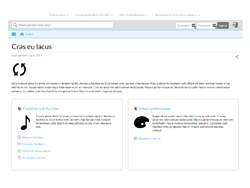
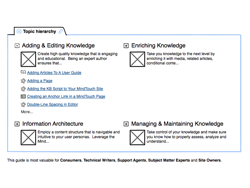
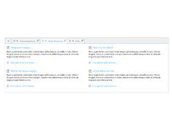
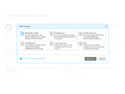
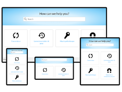
New content framework hierarchy
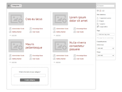
- Category: high-level organizational pages with simple and complex views (e.g. Products, Personas, etc.)
- Guide: sub-sections for organizing articles (e.g. Features, Versions, etc.)
- Article: knowledge content (e.g. topics, how-tos, references, etc.)
- New Framework
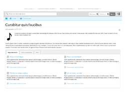


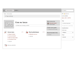
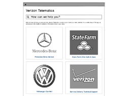
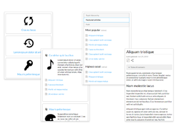
New content framework live example
The Problems to Solve
Before starting on the redesign, I reviewed all the feedback we had gathered from our Customers and Engineering over the last few years regarding the content framework. I compiled the list of problems we needed to fix and broke them out into a list of goals to solve for.
- Knowledge Managers had a hard time building and maintaining their sites
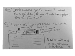
- Pain: Reordering navigation pages was difficult
- Pain: Portfolio pages (prefered nav. strucuture) only available on the home page
- Pain: Not sure which page types to use and where
- Pain: End-users couldn't find content easily when navigating
- The previous version of the content framework's user interface did not adapt
- Pain: End-users had a poor experience when a site had custom branding
- Pain: End-users had a poor experience on mobile devices
- Engineering had a difficult time upgrading features in the content framework because it was overly customizable
Solutions
Below are examples of how I solved for each of the pains we identified from user feedback.
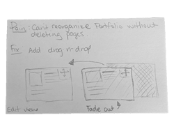
Pain: Reordering navigation pages was difficult
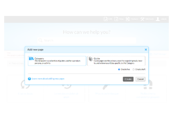
The Portfolio and Product Guide page types allowed content creators to add in navigation links to pages. On the Portfolio, it was to add pages that existed underneath it. For the Product Guide it could be child pages or pages in other hierarchies in the site. Once these navigation links were added, they could not be moved without deleting other pages. This was very frustrating to content creators who renamed pages or reorganized their content structure.
To fix this issue, we added the ability to drag and drop pages that exited on Categories.
- Reordering Navigation - Category


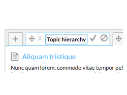
For Guides we added the ability to drag and drop tabs and rename them.
- Reordering Navigation - Guides


Pain: Portfolio pages only available on the home page
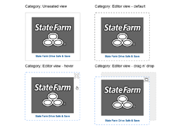
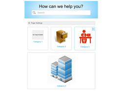
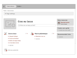
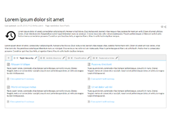
We created a new type of high level navigation page called a Category and were able to place these types of experiences on the home page and in other top level locations in the hierarchy. These Categories could also be nested if a customer had complex product hierarchies. The Category resembled the Portfolio experience or the Product Guide experience by selecting a simple or detailed view in the page settings.
- Replacing Portfolios with Simple Categories
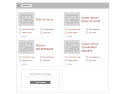
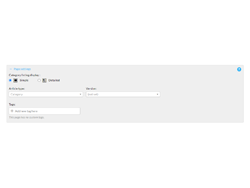


It wasn't enough to just create a simple Category view. Some customers wanted the child page listings as well so we converted Product Guides into Categories and created a second detailed Category option. Now customers had the choice of placing the detailed Categories on the home page or in other locations.
- Detailed Category Option


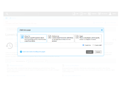
Pain: Not sure which page types to use and where
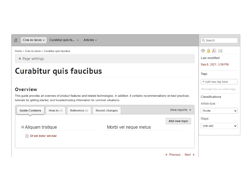
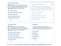
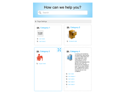
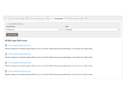
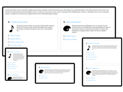
By simplifying the types of pages available in the new content framework we reduced the amount of options available to choose from. Categories and Guides were created to focus on quick navigation through the site, while articles contained the actual knowledge. Categories allowed for quick views of the high level concepts (e.g. product, persona, task, etc.) so users could drill down the correct hierarchy quickly. Guides allowed the Knowledge Manager to pick the way they wanted to organize their articles (e.g. by topic, function, or other classification) so users could find their answers faster. Reduced article choices and the ability to customize article types only below the guide level, kept loose pages organized under guides and not scattered under Categories where they couldn't be found.
- Reduced Choices to Improve Organization


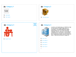
Pain: End-users couldn't find content easily when navigating
In the previous version of the content framework, child pages were automatically created for Portfolios and Product Guides. Knowledge Managers could link to additional child pages manually. While this allowed for faster creation of content and a lot of customization, it made it harder for Knowledge Managers to make sure all content was useful and navigate to.
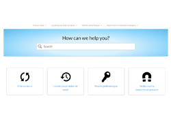
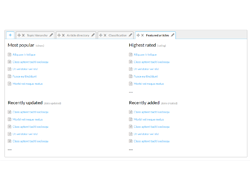
In the new version, we did not auto-create child pages and all sub-page links on Categories and Guides were auto-populated. Nothing is created needlessly and child pages are not lost. We also created the ability to reorder Guides and Categories that existed under a Category so Knowledge Managers could organize their navigation appropriately for their users. In addition, Guide tabs could now be chosen based on what type of navigation the KM wanted (e.g. by topic, tag, classification, or page type).
- Easier Navigation


Pain: End-users had a poor experience when a site had custom branding
Because the platform allows for custom branding, if a customer changed the width of the content container or tried to make their design adaptive, large amounts of CSS were needed to adapt multiple elements in the design. In the new version, because all elements of the content framework were adaptive to their parent element, only minor CSS changes were required.
- Responsive Design


Pain: End-users had a poor experience on mobile devices
The previous version of MindTouch was not responsive. It did not adapt to the screen it was on. This created a very poor experience for any end-users who came on a phone or tablet. The new version was an adaptive design that helped a lot of customers reach more of their audience.
- Mobile Friendly Design


Pain: Upgrading functionality was difficult
From an Engineering perspective, the more customizations and options available for customers to use, the harder it is to make improvements to navigation, search, reporting, etc. With the reduced amount of page types and navigation available, improvements were no longer restricted.
Retrospective
When it comes to designing an experience, I often look back on the end results and see where I could have made improvements. At the time of building this new content framework (back in 2015), I was using the most up-to-date CSS and HTML I could, while following semantic and responsive best practices. While there are minor UI issues I would have changed at the time, overall the design and code have been well received by our customers and are still in use today, six years later.
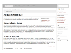
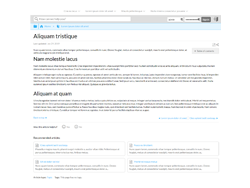
We have had customer feedback around our Topic pages. These are articles that allow for child articles to be nested underneath. When I was creating the content framework, we had a design for navigating to those child articles on the Topic page in addition to just in the Topic guide tab. Unfortunately we ran out of time. It would have been great to add in that functionality so users wouldn't have to navigate up two levels to find content.
What If I Could Build It Today?
If I had the chance to build this content framework again, I would use grid for the layout. It is much easier to use and provides more control. Color was very limited in the original design, so I would add more splashes of the highlight color to show emphasis. Overall space could be reduced as well for a more compact feel.
For Guides, I would create a simpler tab experience, possibly a vertical tab for desktop views. On Categories, I would reduce the page type iconography and add arrow indicators to all child-page links for better legibility. There is currently a show all expand/collapse indicator that I would change the iconography for as well.
One functionality that I would love to implement, would be to reorder child Articles by adding a drag and drop ability to the Topic, Featured, and Tags Guide tabs. Topic pages would have the same ability to reorder their child Articles to make for a more custom navigation experience not based on URL. Currently, both areas rely on Article URLs for organization which makes it harder on the user to control.